An indifference curve depicts a line representing all the combinations of two goods that consumers place equal value. That is to say, they would be indifferent to either good. The consumer has no preference for either combination of goods on the same line because they are understood to provide the same level of utility to the consumer.
Indifference Curve Example
In this example, we will assume that consumers derive the same amount of utility from selecting any combination of the foods.
| Fries | Burgers |
|---|---|
| 35 | 1 |
| 30 | 3 |
| 25 | 5 |
| 20 | 7 |
| 15 | 10 |
The indifference curve has a convex shape because as you consume more of the same product, your marginal utility, i.e. extra satisfaction gained from one more of that product decreases.
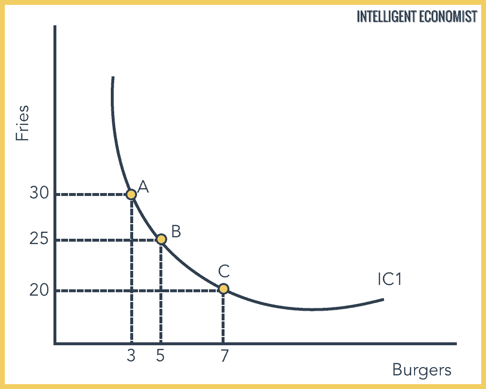
All the choices on this indifference curve have the same utility.
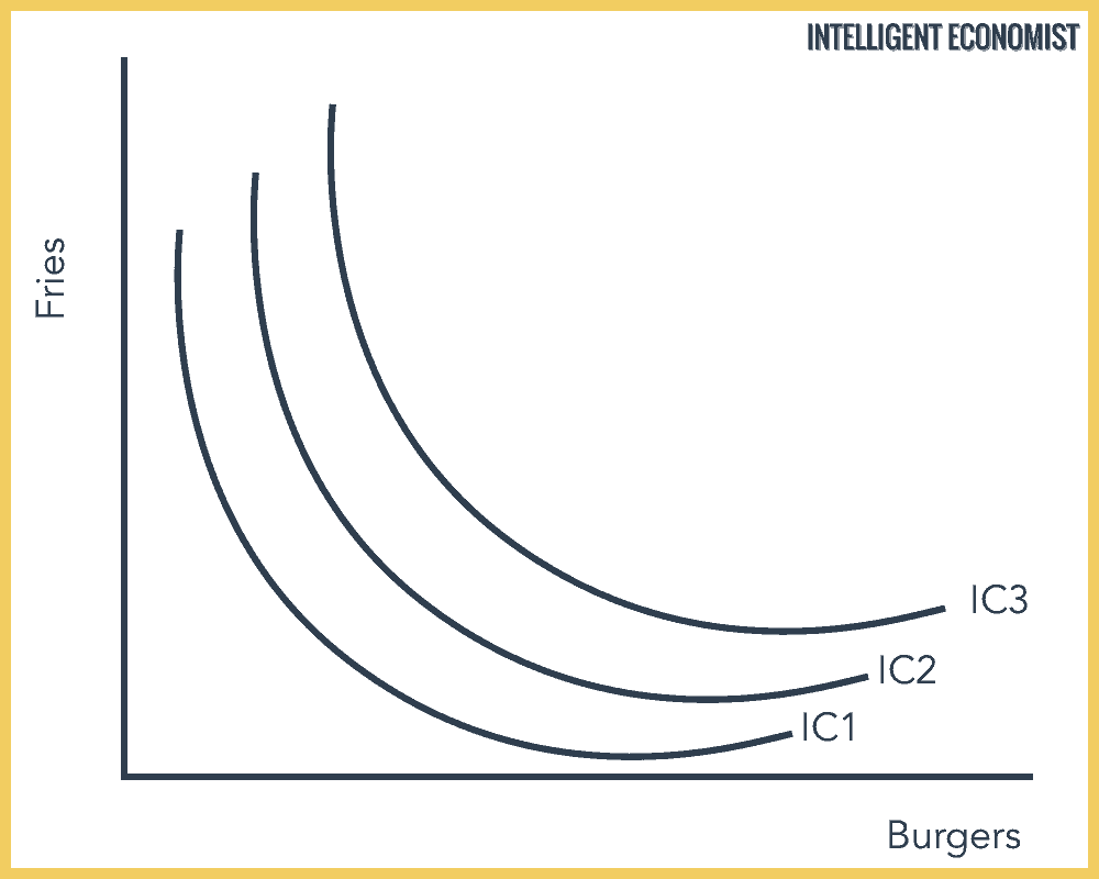
Indifference Map
A graph of indifference curves for several utility levels of an individual consumer is called an indifference map. The higher the indifference, the higher utility compared to indifference curves below it. For example, IC3 has a higher utility than IC2 and IC2 has a higher utility than IC1.
As before, all points on the same indifference curve have the same utility.
The Budget Line
A budget line shows the combination of goods a consumer can purchase with their income. We assume that the income for this consumer is $40, that fries cost $1 and burgers cost $2.
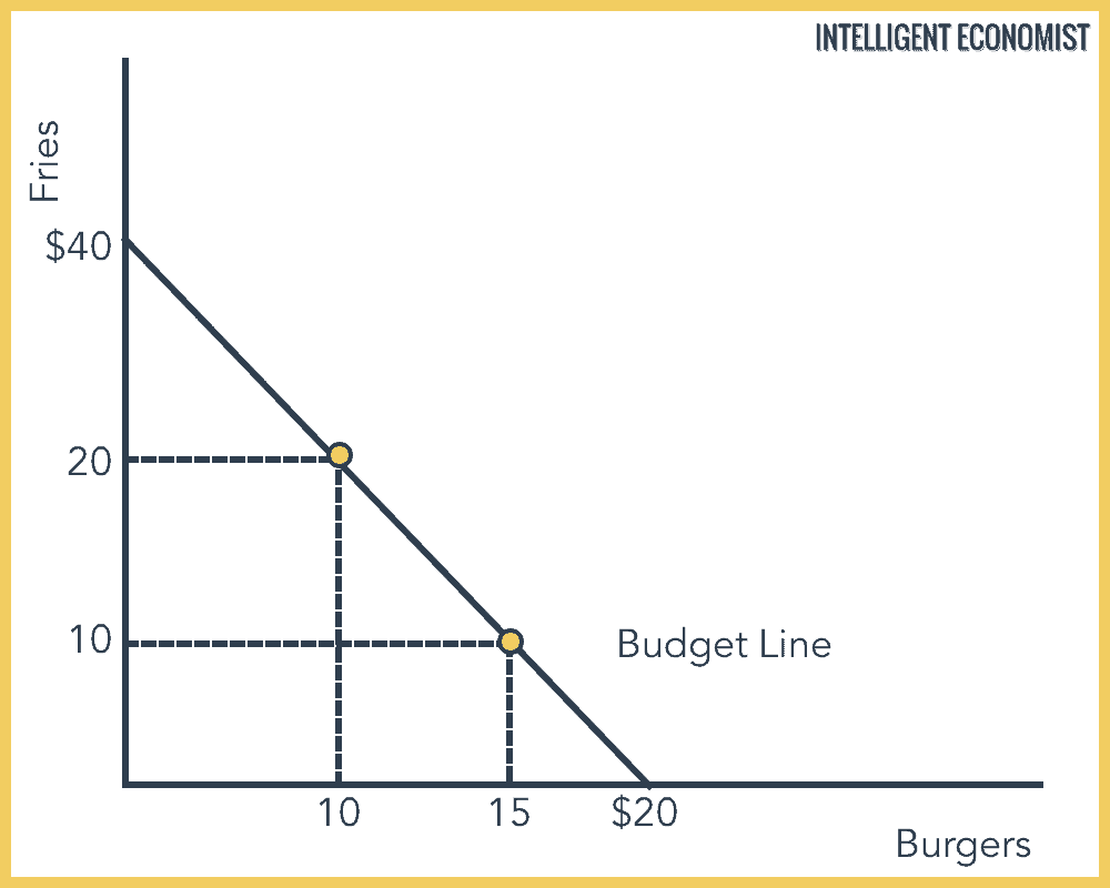
The budget line represents all the combinations of fries and burgers that can be bought with $40. For example, 15 burgers at $2 each and 10 fries at $1 each will add up to $40.