
One of the five major and common macroeconomic goals of most governments is the equitable (fair) distribution of income, which is a crucial element of a functioning democratic society. With regard to this macroeconomic goal, the distribution of income or wealth in an economy is represented by a Lorenz curve.
Note that income and wealth are distinct; one can have a high income but spend it all so that they have a low level of wealth or a high level of wealth without any income at all. The Lorenz curve is usually applied to economic inequality, but technically, it can be used to show the degree of unequal distribution in any context.
The Lorenz Curve’s History
The Lorenz curve was originally developed by American economist Max O. Lorenz in 1905, with the goal of representing the distribution of wealth in American society. At that time, the Gilded Age had just come to an end, around the year 1900; this was a period during the late 19th century when income inequality reached an all-time high in the United States.
Along with the Gini coefficient, which measures the degree of income inequality in a given economy (and which is itself derived from the Lorenz curve), the Lorenz curve is one of the most prominent and widely understood methods of assessing and representing the degree of equitable distribution of income or wealth in the field of economics.
How Does the Lorenz Curve Work?
Based on either their income or their wealth, percentiles of the population are plotted on the horizontal axis (x-axis) of a graph. This is set against cumulative income or wealth, which is plotted on the vertical axis (y-axis) of that graph. This creates a curved line–that is the Lorenz curve. The further away from the diagonal, the curve is, the more quantitatively unequal the distribution of income is. For instance, if the x-value is 20 and the y-value is 10, this signifies that the poorest 20% of the population has 10% of the overall wealth or income.
The curve shows the proportion of income earned by any given percentage of the population. The line at the 45º angle (represented in the graph below by the line marked “Perfect Equality”) has a slope of 1 and shows perfectly equal income distribution. Meanwhile, the other line shows the actual distribution of income (which is marked in the graph below with the label “Actual Income Distribution”).
The more bowed out the Lorenz curve–that is, the deeper or more pronounced the curve–the higher the degree of income inequality in that country’s national economy; meanwhile, a shallow curve that’s closer to the “Perfect Equality” line indicates a higher level of income equality.
How Do You Calculate the Lorenz Curve?
Here are the steps involved in calculating a Lorenz curve:
- Put a list of all incomes in the economy you’re calculating for in order from low to high
- Calculate all income in the entirety of that economy–the total income
- Calculate the lowest 1% of the population’s income, as well as the income of that lowest 1% as a percentage of the total income you just calculated
- Go on to do the same for the lowest 2%, 3%, 4%, and so on
- Place these points on a graph–the fraction of the population is your x-axis (horizontal axis), while the fraction of income is your y-axis (vertical axis)
- When you’ve plotted all the points, you will have a curve–that’s the Lorenz curve
Lorenz Curve Examples
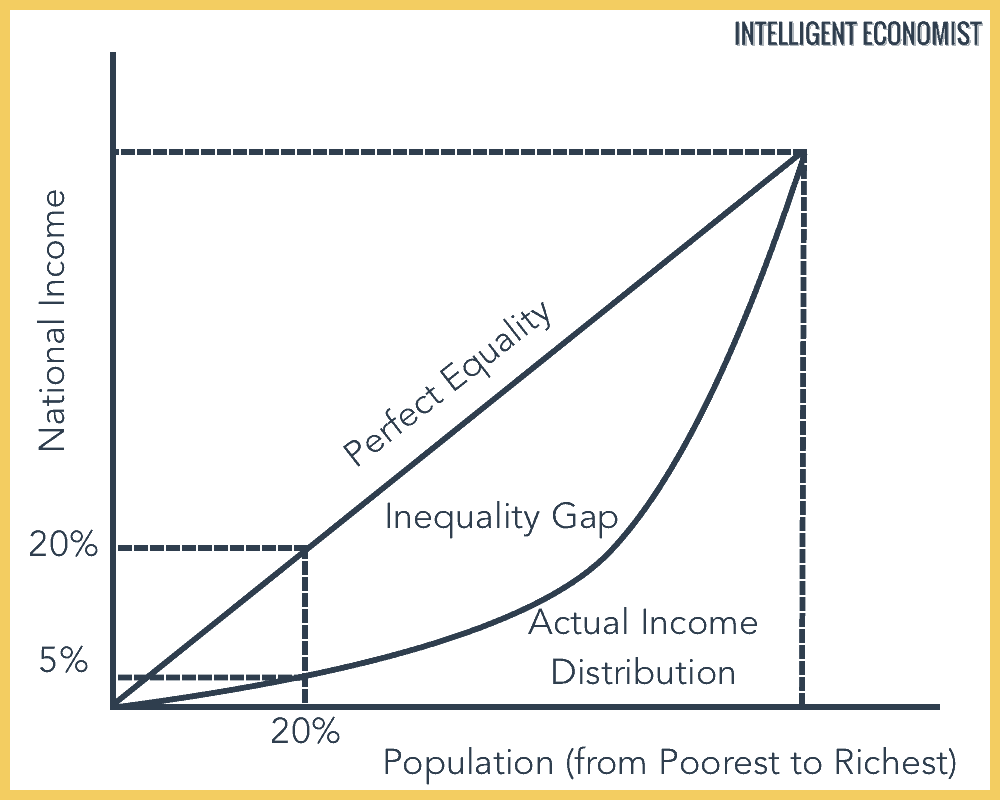
In the below above, the Lorenz curve, which represents the actual distribution of income in a country, shows that the poorest 20% of the population in this society only earn 5% of the total national income. Contrast this with the case of perfect equality, where the poorest 20% of the population would receive 20% of the income; the poorest 50% of the population would receive 50% of all income; the poorest 80% would receive 80% of all income; and so forth.
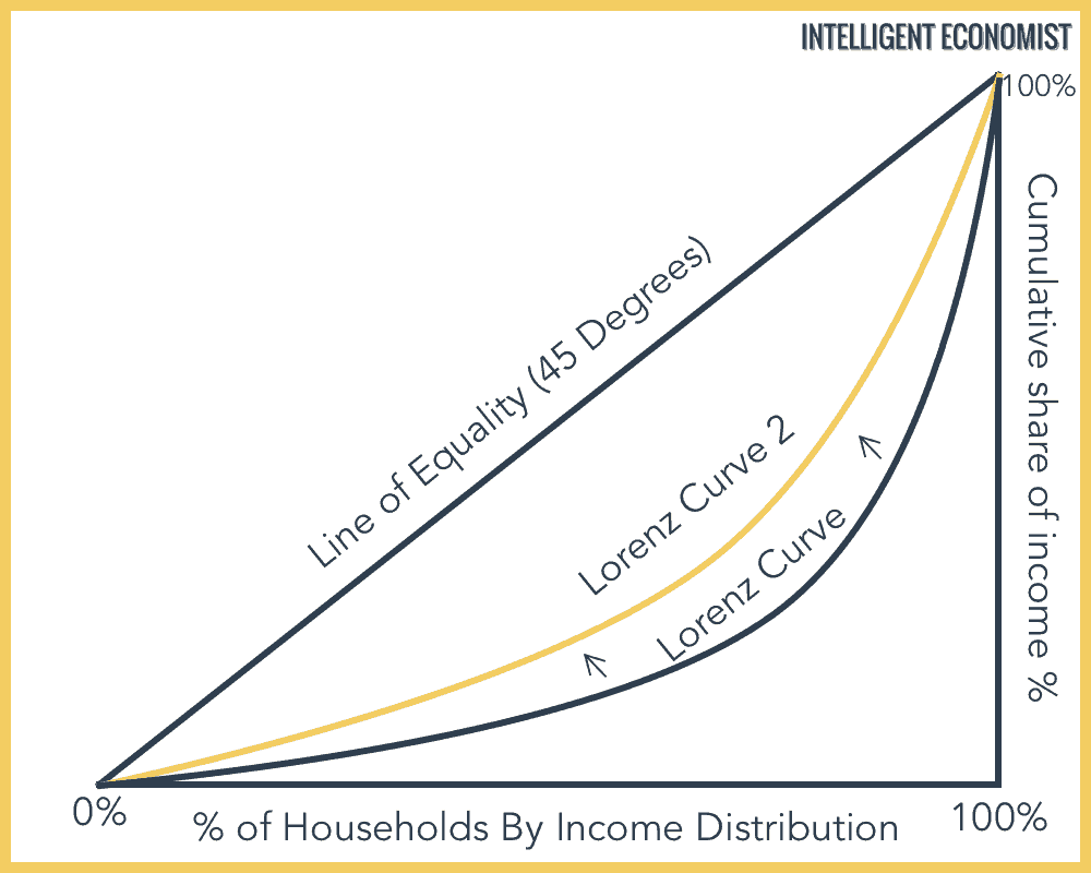
Here is another example graph, in which there is less inequality, with the Lorenz curve now nearer to the line of perfect equality. In this example, the poorest 20% of the population earn 15% of all income in the nation, significantly up from 5% in the last example:
How Does the Gini Coefficient Relate to the Lorenz Curve?
As mentioned above, the Gini coefficient is another common means of assessing and representing income or wealth distribution in a given society. The Gini coefficient is in fact calculated based on the Lorenz curve. One calculates the Gini coefficient by doubling the area between the Lorenz curve and the line of perfect equality, as the deeper, the curve is the larger the degree of inequality and the greater the total space between the two lines.
Equality is not a reasonable goal of economic theory or planning.
It fails to account for individual differences or to reward achievement.
Equitability sounds like a better goal, but is difficult to define.
Equitability likely refers to wealth in proportion to achievement, but achievement is also difficult to define. One obvious definition of achievement is to equate it with results of individual actions taken. That would erase inheritance as a source of equitable wealth. That may be the most important and consequential definition.