
The Gini coefficient, or Gini index, is derived from the Lorenz curve, and like the Lorenz curve, it measures the degree of economic equality across a given population and simplifies this reality into a single number.
How Does the Gini Coefficient Work?
The Gini coefficient can vary from 0 (perfect equality, also represented as 0%) to 1 (perfect inequality, also represented as 100%). A Gini coefficient of zero means that everyone has the same income, while a coefficient of 1 represents a single individual receiving all the income (of course, neither of these extremes are very likely).
The higher the Gini index, the greater the degree of inequality; in the case of a very high Gini index, those with high incomes are taking in a disproportionately large percentage of total income.
The Gini coefficient is equal to the area between the actual income distribution curve and the line of perfect income equality, scaled to a number between 0 and 100. The Gini coefficient is the Gini index expressed as a number between 0 and 1.
How to Calculate The Gini Coefficient
As previously mentioned, the Gini coefficient is derived from the Lorenz curve, which is a graph that also functions as a visual representation of the Gini index. To calculate the Gini coefficient:
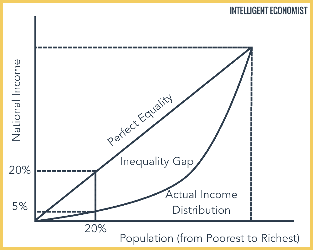
- From the area below the line of perfect equality (this number will automatically be 0.5), subtract the area below the Lorenz curve (see the graph below for a visual guide to what these lines look like)
- Divide this number by the area below the line of perfect equality
To put it another way, the Gini coefficient will be twice the area between the line of perfect equality and the Lorenz curve.
Applying the Gini coefficient to income vs. wealth
“Income” and “wealth” are not synonymous. For instance, it is possible to have quite a bit of wealth but little income, or, conversely, a high income with relatively little amassed wealth. As a measure of economic inequality, the Gini coefficient is typically used to measure income inequality. However, it can also be applied to gauge a population’s degree of wealth inequality.
Applying the Gini coefficient to wealth is less common because wealth is not as easy to measure as income (one reason that this is the case is due to overseas tax havens, where potentially trillions of dollars’ worth of wealth is hidden). When the Gini coefficient for wealth is calculated, it is usually quite a bit higher than the income coefficient, indicating a greater degree of wealth inequality than income inequality in most cases.
Origin of the Gini Coefficient
The Gini coefficient was developed by an Italian statistician of the same name in 1912, published in a paper titled Variability and Mutability. He developed the coefficient out of the work of Max Lorenz, whose Lorenz curve was created in 1905.
Issues with the Gini Coefficient
While the Gini coefficient is a useful and widely-used metric, it is imperfect. Quite a bit of nuance is lost when we attempt to boil down the complexities of an entire economy–or multiple economies, as in the case of global Gini calculations–to one number.
For instance, two countries can have the exact same Gini coefficient, even if one has a very high Gross Domestic Product (GDP) and the other a much lower GDP. Additionally, the Gini coefficient typically fails to clearly represent shifts among the most wealthy 10% of society or among the poorest 40%–and these two demographics are enormously important.
Another failing of the Gini coefficient is the fact that the metric does not take into account informal and illicit economic activity; it can only produce a number based on official statistics for income and GDP. Less economically developed countries tend to contain a greater proportion of informal economic activity, and this form of economic activity is usually taking place mostly among the lower-income distributions. In this case, the result is that income inequality is overestimated because incomes in the lower distribution brackets have been underestimated.
Finally, the Gini index is criticized for its failure to indicate whether the inequality it measures is occurring toward the center of the income distribution, or at the top and bottom percentiles. Because it effectively flattens a two-dimensional shape (that is, the shape of the space between the line of perfect equality and the line of the Lorenz curve) into a one-dimensional number, it doesn’t account for a whole host of potential variations within that single number.
The Gini Index in Practice: A Global Example
There are several estimates for the Gini coefficient worldwide. For instance, around the time of the Great Recession, in 2008, scholars Branko Milanovic and Christoph Lakner surmise that the global Gini coefficient for income was 0.705. This is a moderate decrease from 1988’s estimated coefficient of 0.722, meaning that, by this measure, global inequality has slightly decreased. Milanovic and Lakner’s estimate should be taken with a grain of salt, however, because other economists have their own differing estimates about the global Gini coefficient.
The slight decrease in inequality that these two scholars have documented can be attributed to significant economic development in previously less economically developed regions, including development in Asia, Latin America, and Eastern Europe. Also, just because inequality between nations (inter-national inequality) has decreased slightly, this doesn’t negate the fact that inequality within nations (intra-national inequality) has actually increased during that same time period.
Hy Prateek,
Nice post. I am a bit curious about your point on “Finally, the Gini index is criticized for its failure to indicate whether the inequality it measures is occurring toward the center of the income distribution, or at the top and bottom percentiles.”
Will it be possible for you to share some of the literature regarding this point?
Sincerely,
Mahmud